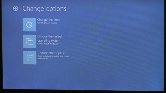
Windows 8 is a major improvement in many ways , not just performance but also a new interface for tablets and the regular desktop. In its latest blog entry Microsoft shows how it has reworked the boot experience from rows with console text to something more functional with even touch support.
The development of Windows 8 is moving forward as fast as before even though the first Developer Preview is out. Since it has changed pretty much everything else, Microsoft thought it was a good idea to deal with the booting experience and bring that into the 21st century. Witht new technologies like SSDs, and UEFI that are starting break through it takes less than 7 seconds to boot the computer. THis is a very short time to work through a lot of data.

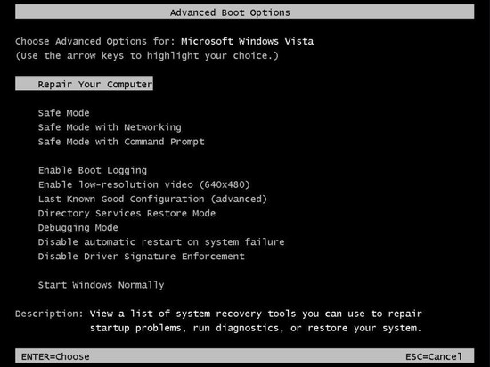 Instead of a black background with white text Microsoft intends to make it more graphic that will also work better on tablets. We will get a more appealing interface that is also more functional than the options we have with Windows 7.
 A logo will be shown when you boot the computer, in this case Samsung since it used a computer from Samsung in the example.
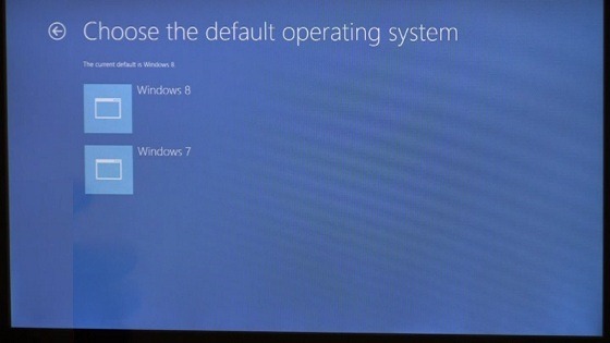 After that the menu where you configure the computer for both Windows 7 and Windows 8 pops up, but you can also change other settings. Including which is the default operating system, and a timer that decides for how long the computer will wait before it starts the default OS. The 30 seconds we have learned to hate is no longer a must.
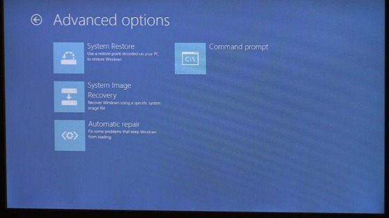
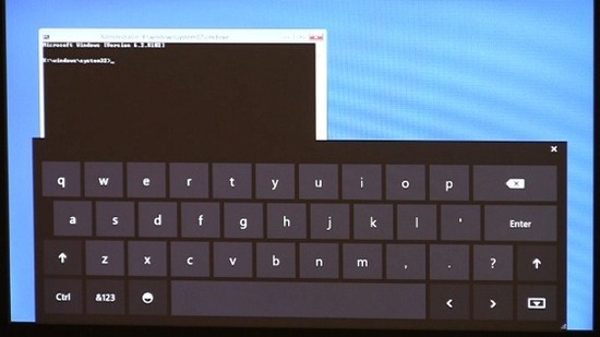 There are also advanced settings for system restore, automatic repairs of the oeprating system or restoring it with discs. The command prompt is still there, with a software based keyboard (if needed) for troubleshooting.
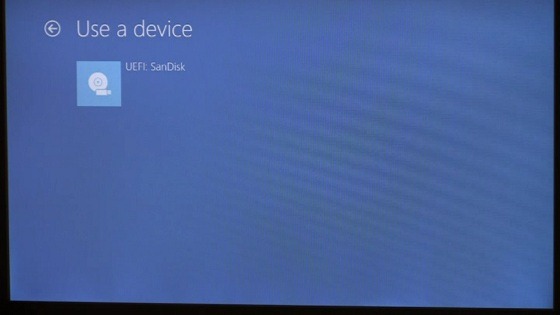 There is no secret that Microsoft wants you to boot from other media, like USB memory sticks, and there is an option for that too.
 It has also removed the well known Blue Screen Of Death, a.k.a. BSOD. Instead we will see a frowny with short description of what went wrong.
Even if you don’t like the new GUI it is an improvement. While the functionality may have been in previous versions of Windows it has been hard to use it. With Windows 8 it looks like all you need is a mouse, or a finger. The clear menues should also reduce the number of calls from family members in distress.
Source: Microsoft


