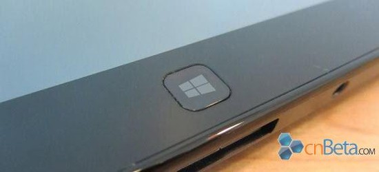
Some logotypes eventually start to grow on you, whether you like it or not, one of them is the Windows logo. This colorful logotype has been around since the launch of Windows 3.0 back in 1990, with some minor modifications up to today. Microsoft is apparently going to try something new after 22 years.
The Microsoft logotype from early 90s is hardly pleasing for the eye today, which is why it was updated with the launch of Windows XP. It was basically the same logotype as before, just prettier with no black borders and less obvious pixels.
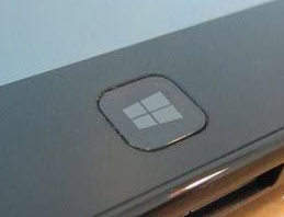
Windows 8 is less than six months away, and will be Microsoft’s biggest change since the GUI was introduced? It is probably why it has decided to change the Windows logo for something more clean, an actual window.


These are leaked pictures from Windows 8 Consumer Preview, and what is claimed to be some sort of tablet running Windows 8. With these units there is a requirement to show the logo, but we’re not entirely sure that’s a good thing?
Source: cnBeta


Fake maybe?
http://www.winsupersite.com/article/windows8/windows-8-secrets-windows-8-dropping-start-button-142236